This blockout is based of Horizon Forbidden West
For my second blockout in the Horizon series I wanted to kick things up a notch and create a Rebel camp. These are bigger combat dedicated spaces where the rebels have taken a lot of space. For this blockout I wanted to focus on different things, those being: Verticality and Empty Space. This was quite a step up from a rebel outpost, so I started by doing my research. This level would be based of a University, since I was enrolled at a University at the time.
Research
I wanted to get a good impression of the Rebel Camps. To do that I played Horizon Forbidden West and took note of everything I noticed with a focus on verticality.
I kept these notes on my reference board at all times, so I would always keep them in mind when sketching and building the level.
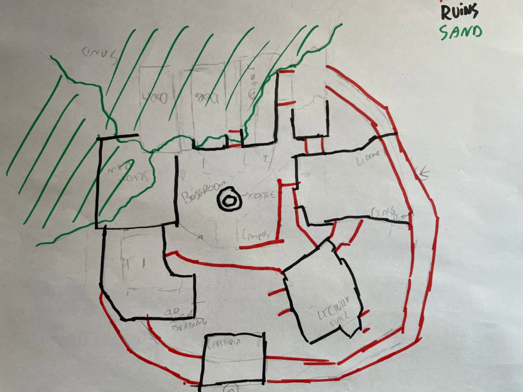
The original sketch was a bit simpler, only having the key buildings in them and the Tenakth structures. I wanted to give myself wiggle room to experiment with giving the player verticality.
Verticality
Verticality in Level Design is something I’ve always been interesting in. This is what separates 2D from 3D games and makes them more complex. Horizon takes full advantages of that fact as well.
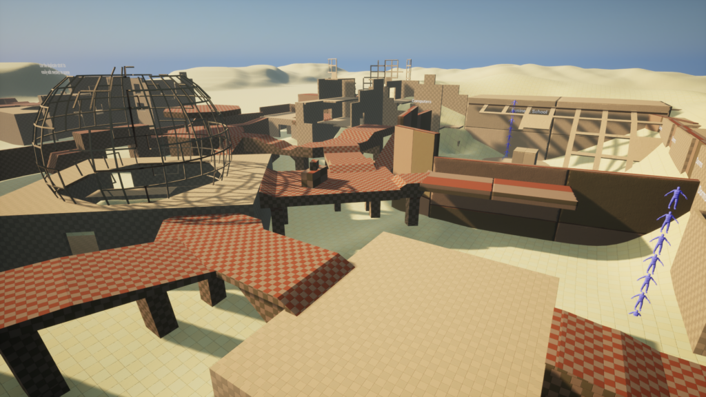
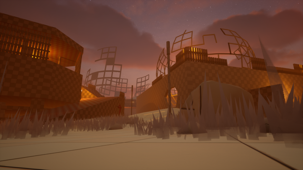
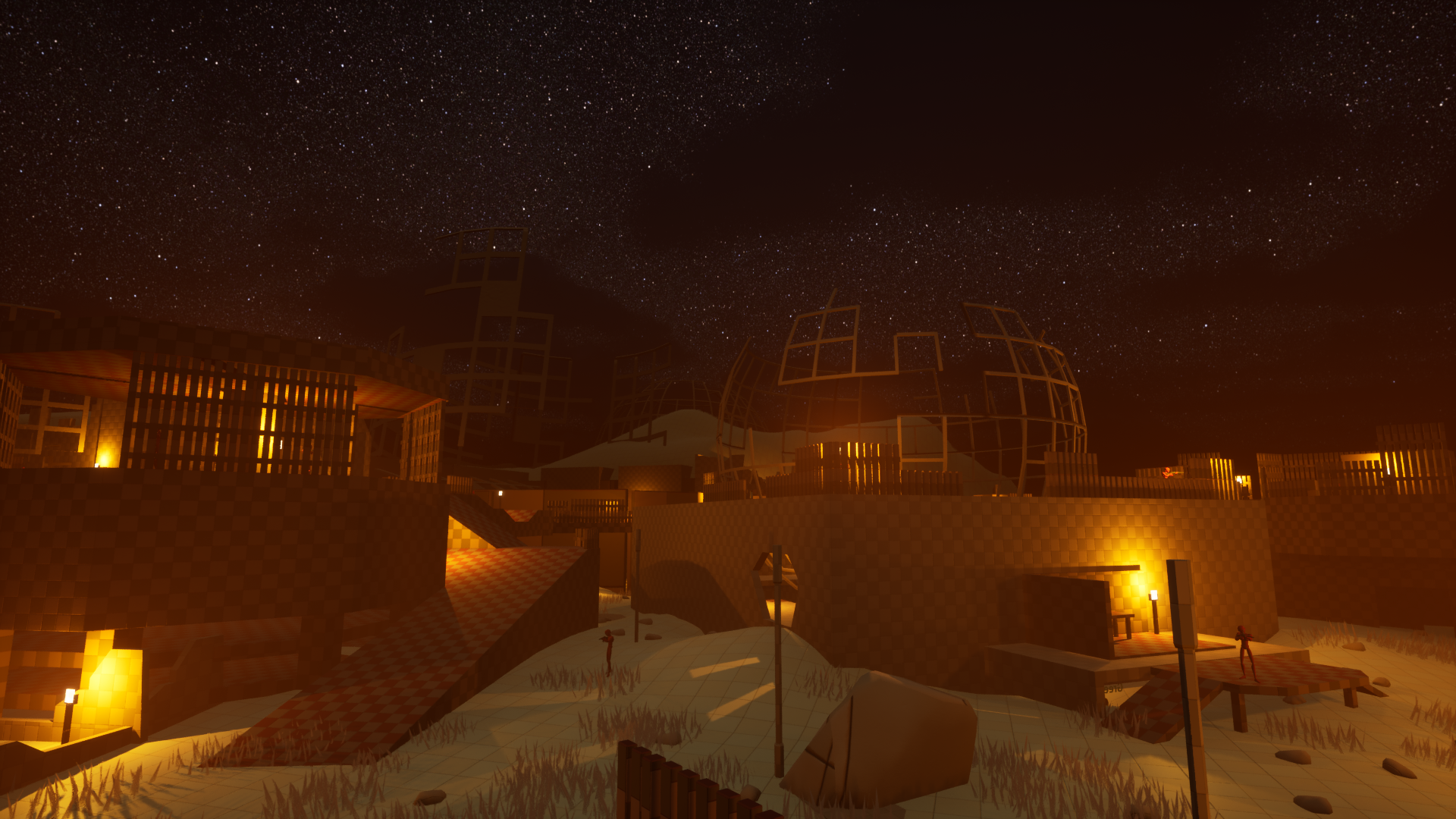
This level had 2 main grounds so to say. There is ground floor and rooftops. The ground floor speaks for itself, but the rooftops are connected to one another by the Tenakth structures.
You can access the rooftops from the ground floor, the catch is that these access points are usually not easily available. In Horizon, verticality is power since Aloy can use it to gain better line of sights. For players to gain this power they need to put themselves in danger first. I also heavily reduced the entry points to the rebel camp, by having less entry points I as a developer have more control over what area the player could be in. The fact that players have different entry points is already enough to sell the feeling of freedom.
Empty Space
Empty Space is a powerful weapon for a designer. It can evoke emotion, tension or relaxation into the player but also boredom, frustration and danger. It has to be used carefully!
When I designed the blockout for this level, I wanted to have some space between the different buildings. Creating a sense of scale, but also giving the player time to explore and enjoy the Ruin.
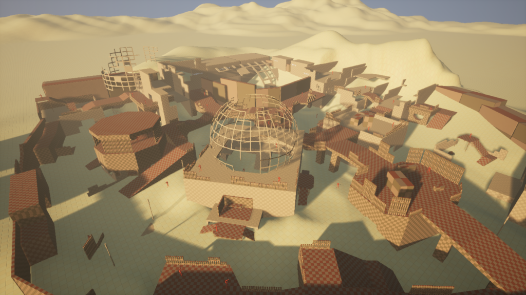
Verticality actually turned out to help with the illusion of space in this case. Because the rebel camp had so many bridges across it, the space in between buildings felt more packed and alive. This helped make the environment feel more interesting and alive. Empty space gave the player more time to breathe and take in the level, which made traversing it much more fun!
Conclusion
Looking back, I’m happy I took the challenge! The level is not perfect, and at times I felt lost on how to design the Tenakth areas, but I’m really happy with the overall structure and layout of this level. Definitely good practice!